Case Study -
Powerful data vizualization libraryWe believe powerful data visualization should be simple and accessible. Grapper is a tiny microframework (only 12 kB gzipped) that lets you build and manage graphs effortlessly with clear templating directives.
It is free, built on open standards, and engineered for easy integration with any modern framework or plain HTML.
- Client
- Innovation Project
- Year
- Service
- Technology, Development, SVG
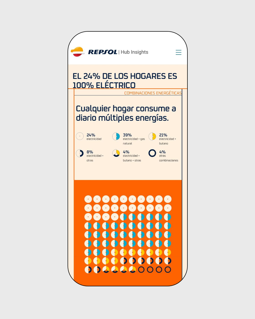
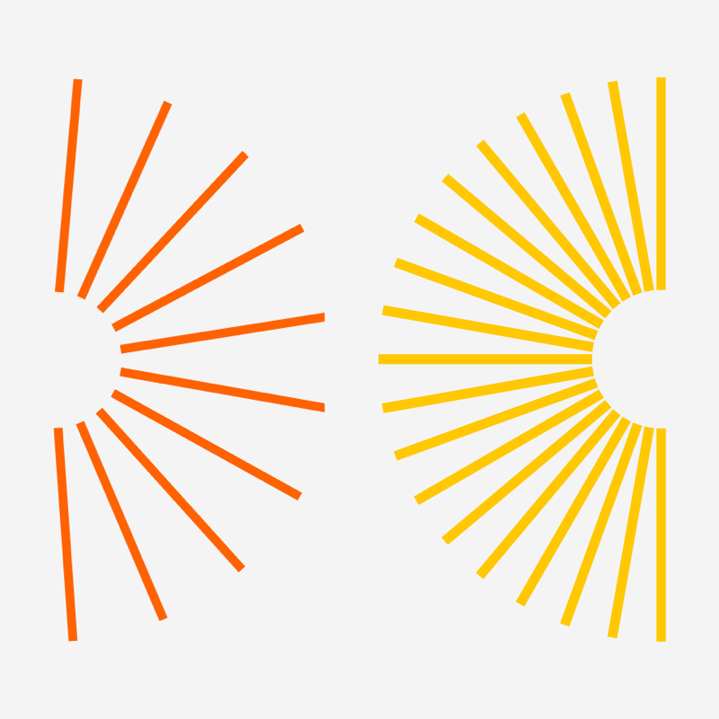
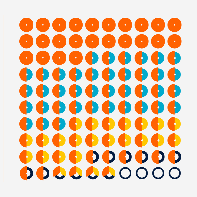
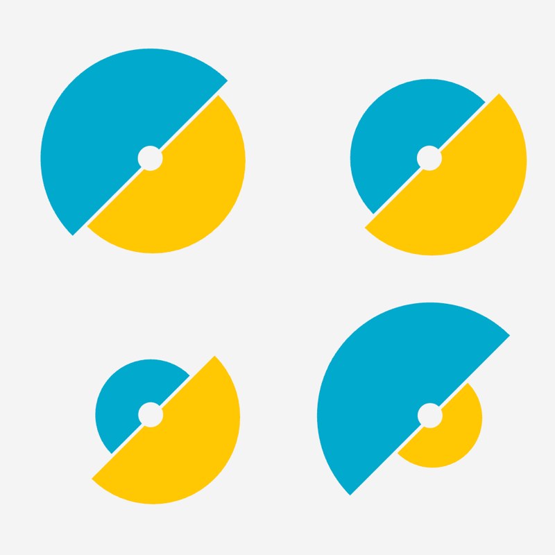
Custom views
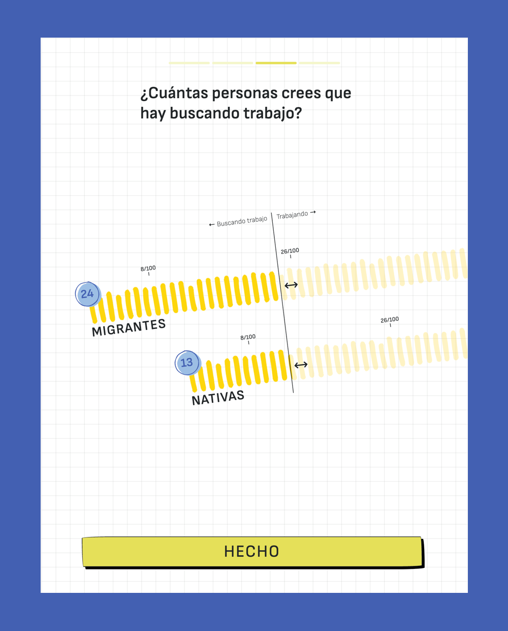
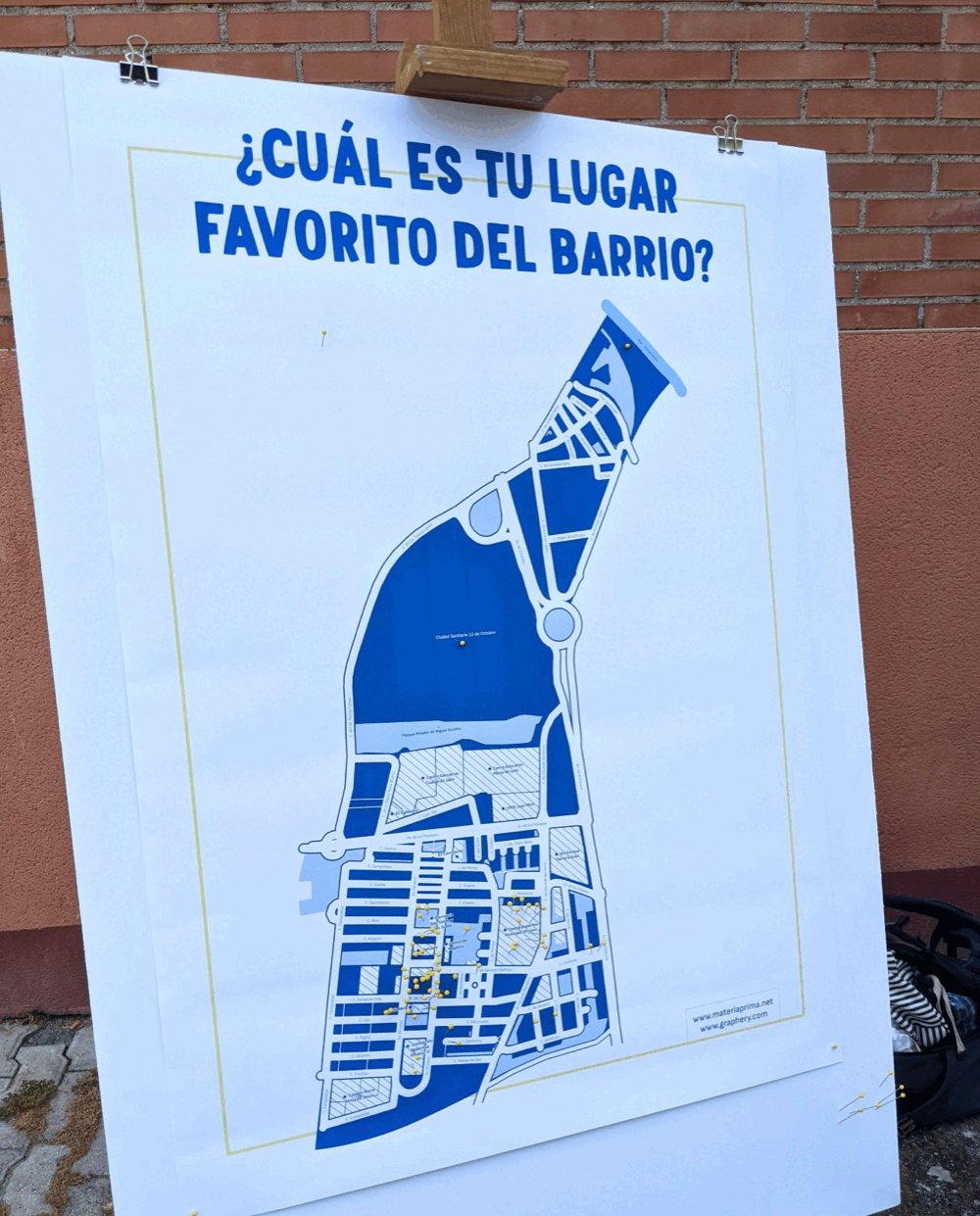
Data featured throughout the report, but we didn’t want it to look like a simple list of figures. That’s why we designed unique visualisations, tailored to each section of information.
This approach made the document something fresh and new, a direct gateway to curiosity. It didn’t just present information: it invited readers to pause, explore and read on.
Visualisation has evolved from being merely a graphic tool into something with a voice of its own: distinctive, appealing, impossible to ignore.
A structured and powerful narrative
To shape this narrative, we worked alongside our partners at Materia Prima. We compiled findings from previous research, organised internal data and combined it with official sources. From there, we built a clear and coherent strategic narrative.
The narrative was structured around five key areas for the company: current household needs, energy consumption patterns, the competitive landscape, customer acquisition and retention.
The figures underpinned each transformation, whilst the visualisations illustrated them clearly and powerfully. All of this was accompanied by direct language, which reinforced the visual narrative and facilitated the absorption of the message and subsequent reflection.
Easy to share, easy to consume
A key aspect was that this report wasn’t simply presented; it was shared widely. The priority was that anyone could access it at any time and from any device, without any barriers.
Whether someone opened it on their mobile whilst travelling on the underground, checked it on their computer during a break, or read it over their morning coffee, they always found the experience smooth, user-friendly and inspiring.
The document was designed to adapt to different paces and everyday situations, with a multi-device design that made it easy to read and truly accessible.
What we did
- Data Visualization
- Data Consultancy
- Strategic Storytelling
- Development (D3.js)